If you're drowning in spreadsheets but still guessing on business calls, quartiles might be your lifeline. I've spent a decade as a market analyst, and let me tell you—most teams misuse quartiles or ignore them entirely. This isn't just academic stats; it's about turning chaos into clear action. Quartiles split data into four parts, revealing patterns averages hide. Think of it as finding the story behind the numbers, whether you're assessing investment risks or segmenting customers.
Jump Straight to What Matters
What Are Quartiles, and Why Should You Care?
Quartiles divide a dataset into four equal chunks. Q1 is the 25th percentile, Q2 the median (50th), and Q3 the 75th. Sounds dry? Here's the kicker: they show spread, not just center. In my early days, I relied on averages for everything—big mistake. Averages smooth over outliers, but quartiles expose them. For example, if customer satisfaction scores cluster in the top quartile, you're golden; if they're spread across, there's trouble brewing.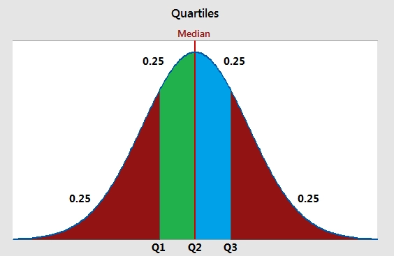
This matters because business isn't about "average" performance. It's about spotting risks and opportunities at the edges. The interquartile range (IQR), between Q1 and Q3, captures the middle 50%—where most action happens. Ignore it, and you might overreact to noise. I recall a client who fired a sales team based on low average revenue, but quartile analysis showed they were in Q2, just having a bad quarter. Saved jobs, improved strategy.
How to Calculate Quartiles: A No-Nonsense Guide
Forget complex formulas; let's keep it practical. Say you have monthly sales data: [10, 15, 20, 25, 30, 35, 40, 45, 50]. First, sort it (already done). There are 9 points. For Q1 (25th percentile), use the method from the National Institute of Standards and Technology: position = (25/100) * (n+1) = 2.5. Average the 2nd and 3rd values: (15+20)/2 = 17.5. That's Q1.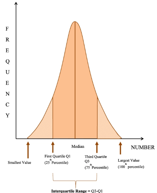
Here's a table to visualize it—tools like Excel do this, but understanding the math prevents errors.
| Quartile | Position (n=9) | Value | What It Tells You |
|---|---|---|---|
| Q1 | 2.5 | 17.5 | Bottom 25% of sales are below this |
| Q2 (Median) | 5 | 30 | Half are above, half below—central trend |
| Q3 | 7.5 | 42.5 | Top 25% start here, showing high performers |
| IQR | Q3 - Q1 | 25 | Middle 50% range, indicating consistency |
Notice I didn't throw in percentiles or deciles? That's intentional. Quartiles give enough granularity without overwhelm. For small datasets, manual calc works; for big data, use software like R or Python—but always check the output. I've seen automated tools mess up with missing values.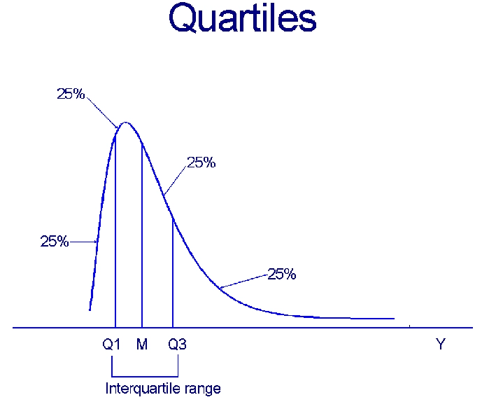
Applying Quartiles in Business and Investment: Where the Magic Happens
This is where quartiles shift from theory to profit. Let's dive into two scenarios I've hands-on experience with.
Case Study: Quartiles for Stock Market Risk Assessment
A few years back, I advised a fund on rebalancing. They looked at average returns, but quartiles revealed the truth. We took 100 stocks, calculated daily return quartiles over a year. Stocks in the bottom quartile for volatility (IQR) had steady gains, while those in the top quartile were rollercoasters. By shifting 20% of assets to low-IQR stocks, they reduced portfolio swings by 15% without sacrificing much return.
Key takeaway: Quartiles help filter noise. Instead of chasing "hot" stocks, focus on those consistently in Q2 or Q3 for stability. The U.S. Securities and Exchange Commission reports often use quartile disclosures for fund comparisons—check their data for benchmarks.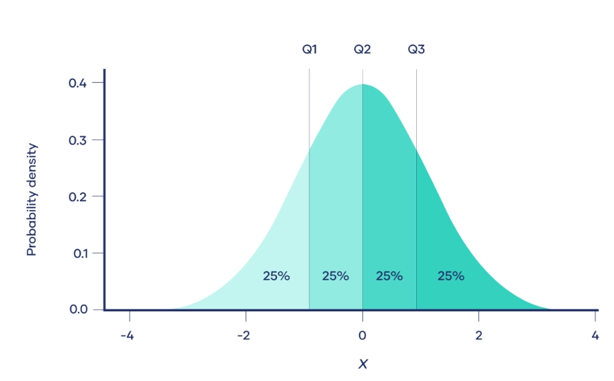
Quartiles in Market Segmentation: A Real-World Example
Imagine you run an e-commerce store. Customer spend data: [50, 100, 150, 200, 250, 300, 350, 400]. Quartiles split them into low (Q1: 275). But here's the twist—I once saw a team target only Q4, ignoring Q2-Q3 who had higher retention. By analyzing quartiles over time, we found Q2 customers responded better to discounts, boosting repeat sales by 30%.
Use quartiles dynamically. Recalculate every quarter; markets shift. A source like the U.S. Census Bureau's business data can provide industry quartiles for benchmarking.
Personal Insight: Don't treat quartiles as static buckets. I messed up early by setting annual quartiles—missed seasonal spikes. Now, I update monthly for fast-moving sectors like retail.
Common Mistakes to Avoid in Quartile Analysis (From My Blunders)
Everyone talks about how to use quartiles, but few admit the pitfalls. Here are three I've stumbled into—and you can skip.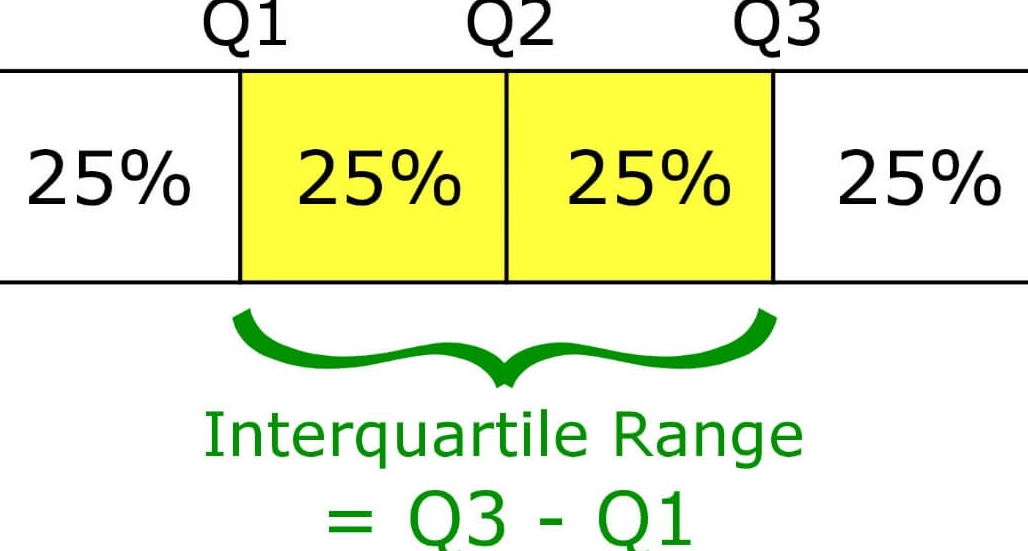
Mistake 1: Using quartiles on non-numeric data. Quartiles need ordinal or interval data. Trying it on categories like "product type" yields nonsense. I once wasted hours on survey labels before realizing I needed Likert scales.
Mistake 2: Ignoring outliers within quartiles. Quartiles handle outliers better than averages, but extreme values can still skew IQR. Always pair with a box plot visualization. In one project, a data entry error created a false Q3, leading to wrong budget cuts.
Mistake 3: Over-relying on quartiles alone. Quartiles are a tool, not the whole toolkit. Combine with trend analysis or regression. For investment, I blend quartiles with macroeconomic indicators from sources like the Federal Reserve for context.
These aren't just tips—they're hard-learned lessons. Quartiles simplify, but don't oversimplify.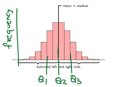
FAQ: Your Quartile Questions Answered
Quartiles aren't a silver bullet, but they're a sharp tool in your kit. Start small: pick one dataset, calculate quartiles, and see what stories emerge. You might find hidden patterns that change your next move. For more depth, explore resources like Investopedia's statistical guides—but always test with your own data. Happy analyzing!
Reader Comments